GALLOS EN PRINT MAGAZINE
Un extracto de Print Magazine - Nuestras 25 Nuevas Tipografías favoritas del 2020
Texto por Zachari Petit
¡Este año empezó con buenas noticias! Nuestra tipografía Gallos, diseñado por Diego Aravena y Salvador Rodríguez, fue seleccionada por Print Magazine como una de sus fuentes favoritas del 2020.
Lee a continuación lo que escribieron sobre la tipo.
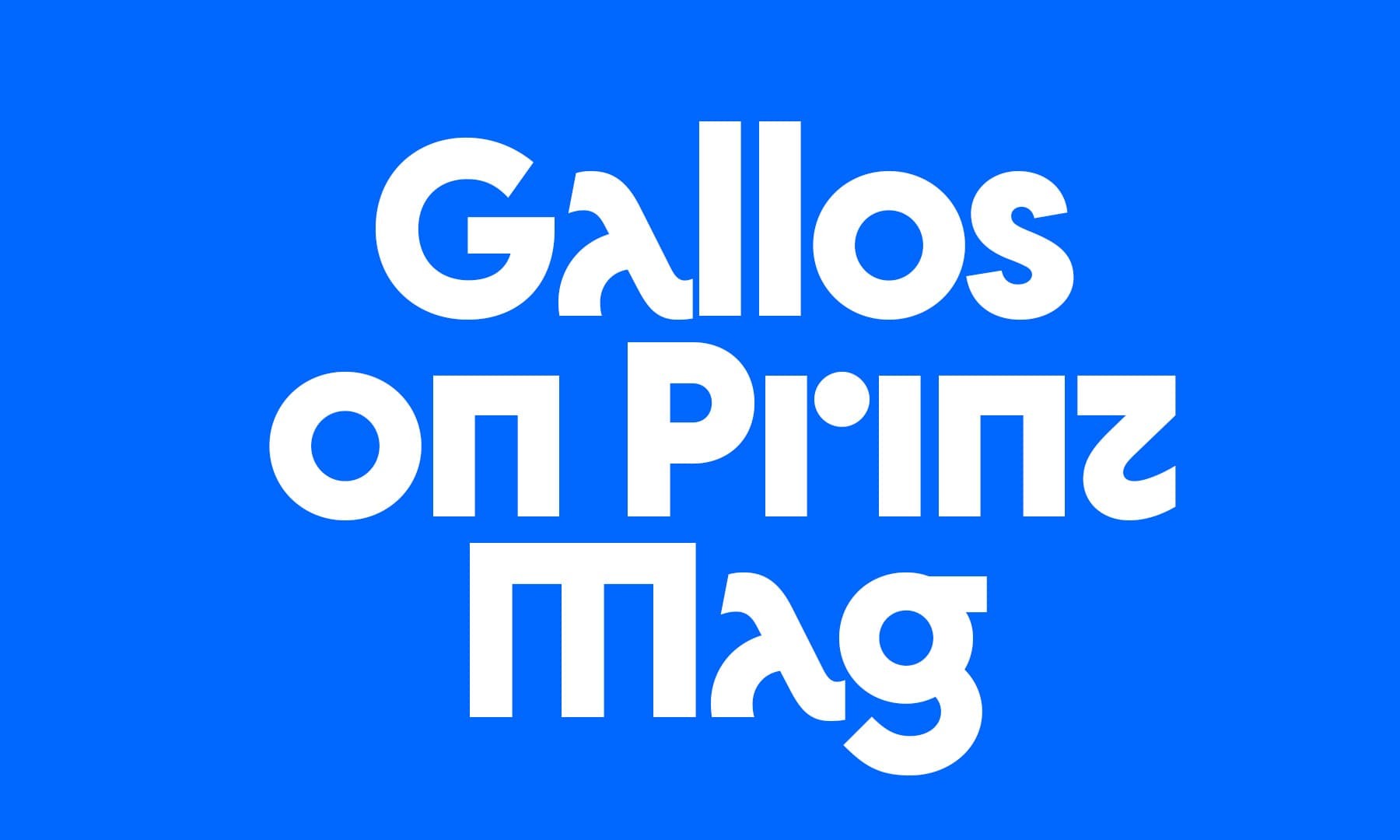
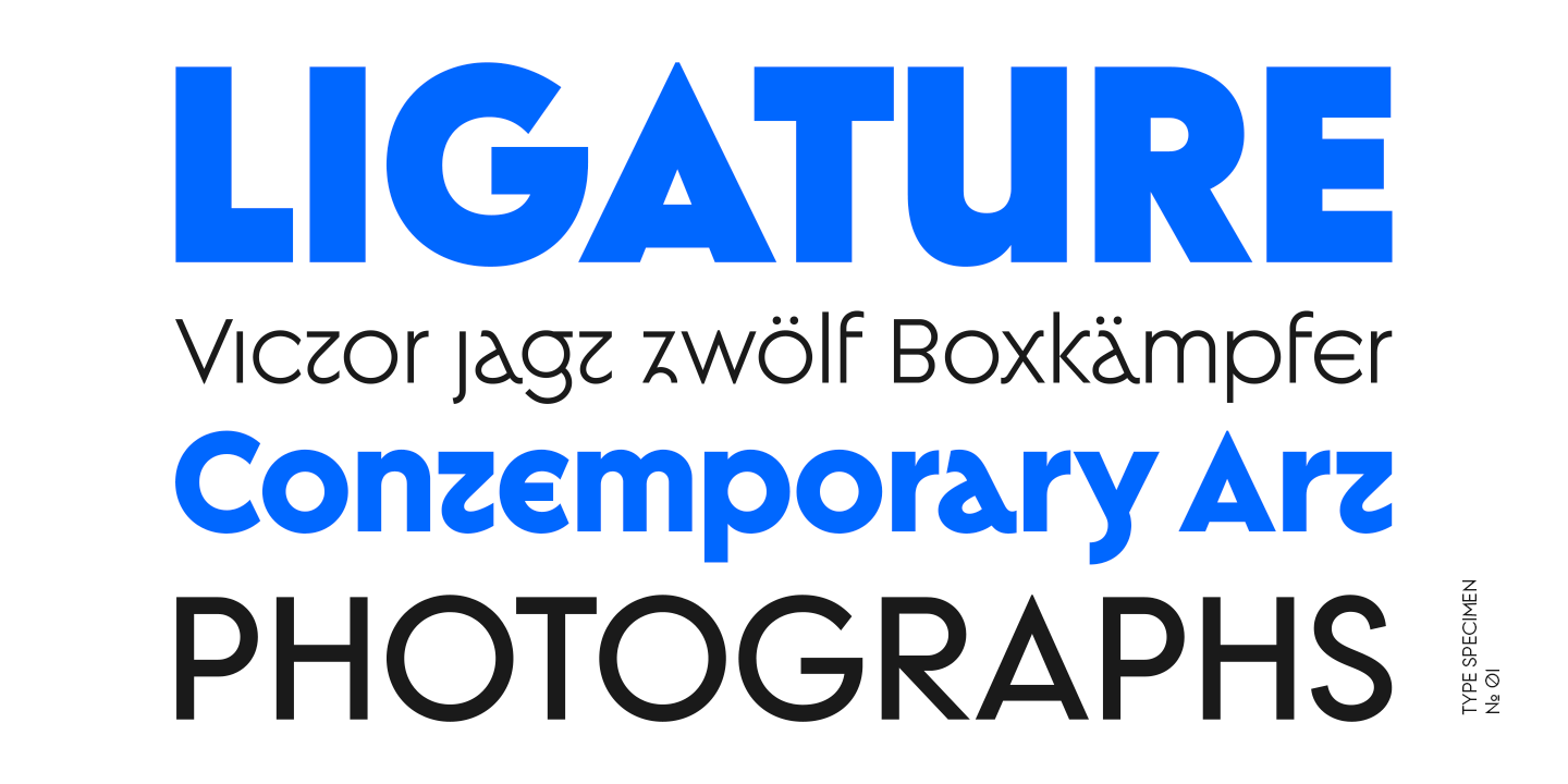
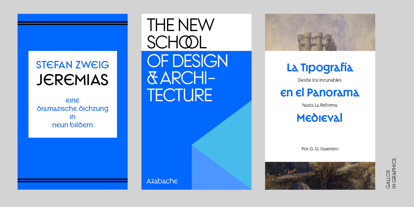
Gallos
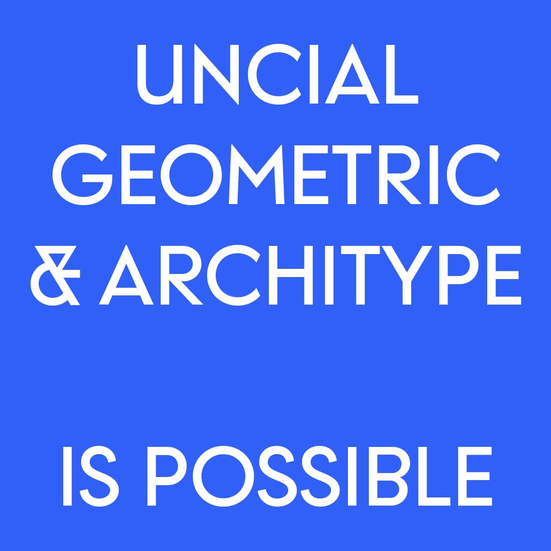
W Type Foundry está en una misión autoproclamada para traer de vuelta las unciales.
Para resucitar los textos -que fueron populares entre los siglos IV y VIII d.C.- el estudio chileno está elaborando una alquimia tipográfica.
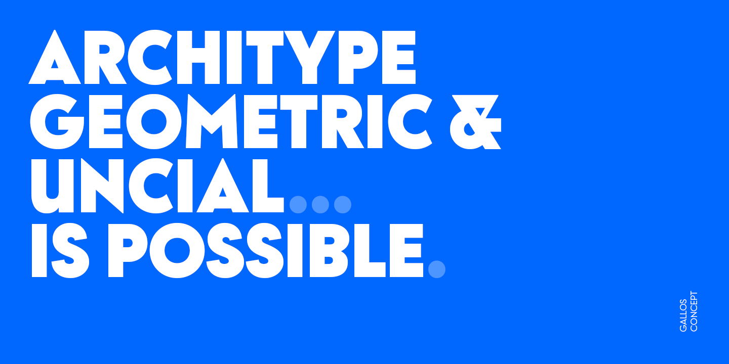
Mientras escriben, “¿Qué te viene a la mente si digo Architype, Geometric, Gaélico y Uncial? ¿Una combinación imposible de funciones? ¿Una configuración poco realista de gustos tan extraña como tu lista de música? ¿O parte de una broma contada por tu comediante favorito? Simplemente relájate y mantén la idea de que [es] posible ".
Sobre el papel, la tipografía resultante, Gallos, no parece que debería funcionar. Pero luego te sientes atraído por la distintiva "a" de Diego Aravena Silo y Salvador Rodríguez, y te das cuenta de que sí.
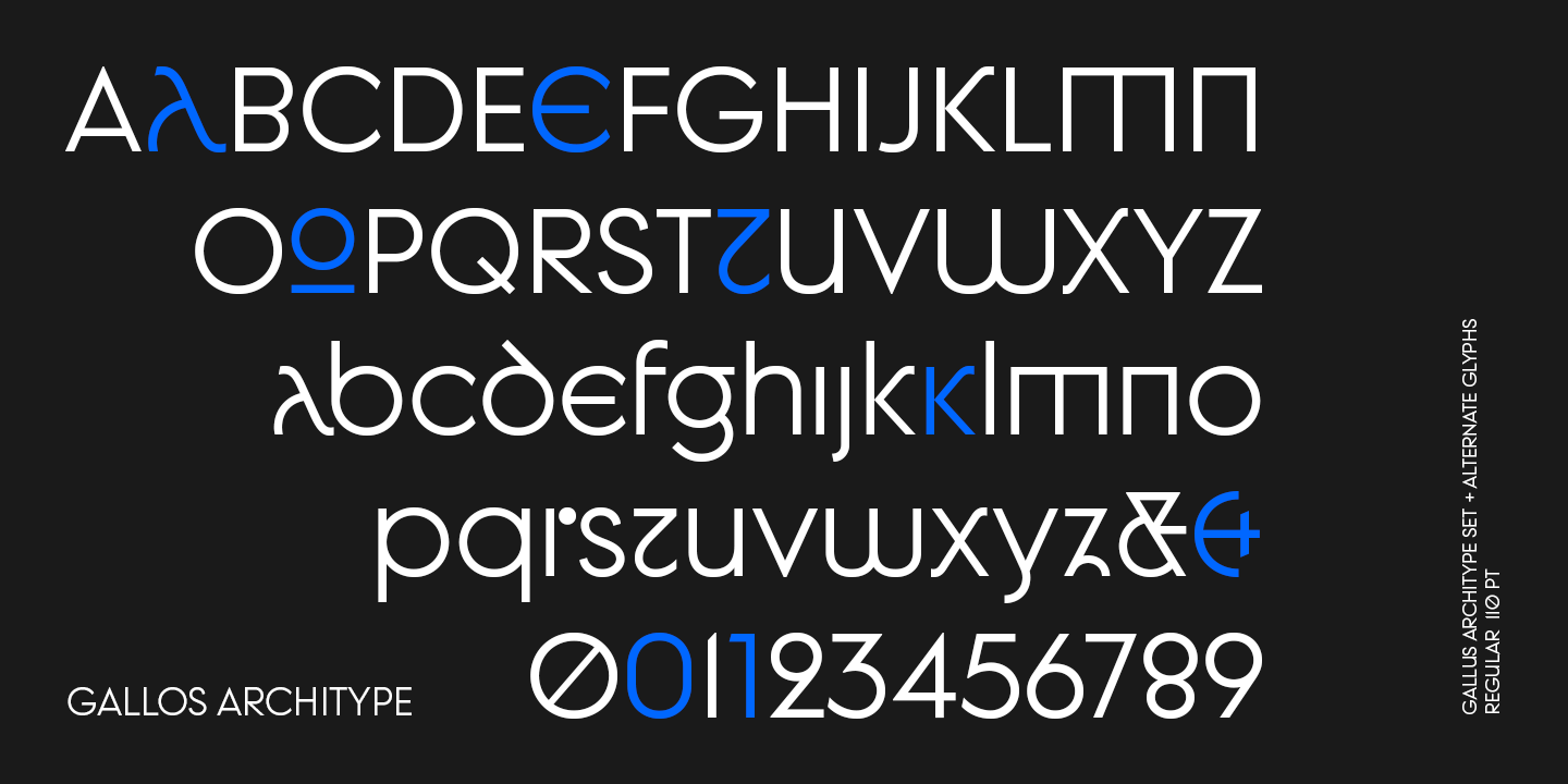
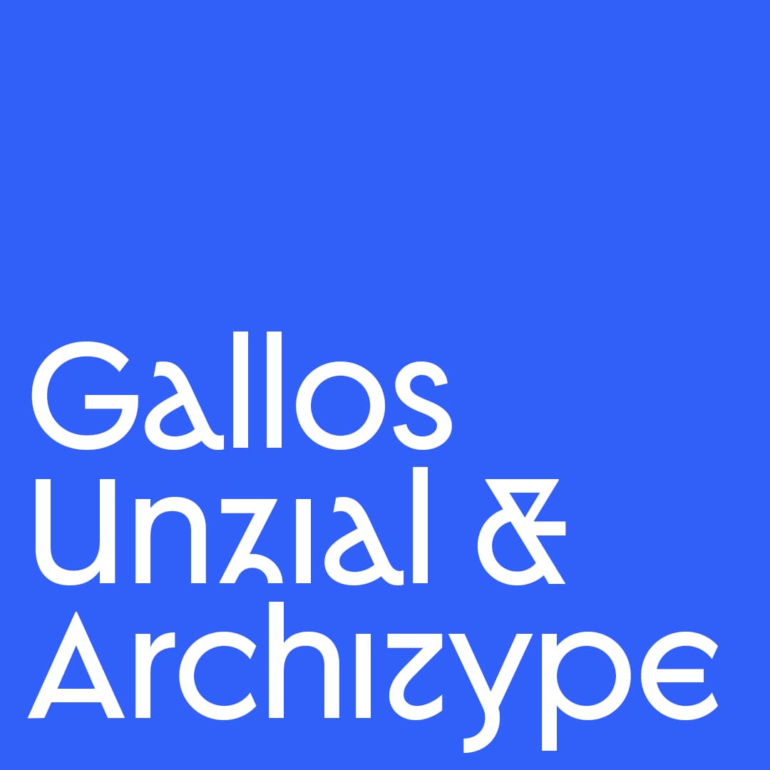
La tipografía toma forma en dos subfamilias: Gallos Uncial y Gallos Architype. Toques de peculiaridad y personalidad demarcan el camino de la fuente gracias a una 'M', 'N', 'W', 'a', 'm', 'n,' 'r' y 'w' únicas para cada tipo.
“El aspecto de escritura uncial [muestra] la 'a' inclinada con un cuenco cerrado, y el estilo geométrico clásico [representa] letras mayúsculas y minúsculas más convencionales 'm' y 'n'. Architype [subfamilia] está inspirado en el modelo "Architype" de Paul Renner, por lo que la 'a' inclinada tiene un contorno abierto, la 'r' está compuesta por un tallo y un punto, y el resto de las letras mencionadas fueron construidas usando características racionales cuadradas. Ambos modelos están conectados por características unciales clásicas como el trazo curvo 'e' y el eje curvo 't', y con ondas gaélicas que se pueden ver en letras mayúsculas y minúsculas 'K' y 'X' ".
¿Traerá de vuelta a los unciales?
… Dudoso.
Aun así, nos alegra ver los resultados de los diseñadores que hacen viajes tipográficos en el tiempo.