Interview

ENTREVISTA A FER COZZI: "LA TIPOGRAFÍA ES CAPRICHO, ES REGLA Y TAMBIÉN POSIBILIDAD"

La diseñadora de tipografía argentina Fer Cozzi ( Buenos Aires, 1986 ) ya dibujaba cuando era pequeña, alentada por su papá, quien, contrario a las aspiraciones de muchos progenitores, fantaseaba con la idea de que su hija estudiara Bellas Artes.

Adriana Conde —

IG: @fercozzi_letras

Gracias a una profesora de secundaria y a dos libros que su padre le prestó, “Pensamiento Tipográfico” de Rubén Fontana y “La nueva tipografía” de Jan Tschichold, se apasionó por las letras y estudió Diseño Gráfico, especializándose después en Diseño de Tipografía. Se convirtió, como ella define, en “una groupie de las letras”.

Fer tiene un romance con las tipografías y cuando le preguntamos que es lo que mueve ese amor, ella nos responde, "De la tipografía me enamoró todo, desde la arbitrariedad de decir que una letra es un sonido, a tener que pensar un sistema que debiera ser altamente combinable entre formas llenas de caprichos. Tipografía es capricho, desde el minuto cero es pura regla y pura posibilidad. No sé si hay otra disciplina que tenga tanto campo fértil como límites establecidos, eso es un desafío hermoso, divertido. Hago letras porque me divierte, y divertirse lleva un montón de trabajo".

Hago letras porque me divierte, y divertirse lleva un montón de trabajo

Actualmente Fer participa regularmente en la Bienal Tipos Latinos representando a Argentina, todos los involucrados en el mundo de las letras del continente Latinoamericano se han dado cuenta de la constante mejora regional, algo con lo que concuerda la diseñadora.

Tipografía Tomasa

"Llevo varios años formando parte de Tipos Latinos, y cada edición me sorprende con algo nuevo. Hay gente pensando y haciendo cosas con inquietudes y libertades que mueven el límite de lo que es el imaginario de tipografía argentina o latinoamericana. Sí que hay un modo más ‘latino’ de hacer tipografía, más irreverente, menos formal, de ‘no sé que estoy haciendo y lo hago igual’, pero también hay un interés en ser más “neutral”, disimular que somos de acá. Particularmente en Argentina, hay mucho interés por la letra en todos sus aspectos (caligrafía, lettering, tipografía...), pero aún no hay una concepción de industria tipográfica, tanto al diseñarla como al consumirla legalmente. Es cuestión de mover más todo, de insistir, de hacer, de hablar… hasta que sea algo entendido y entendible como profesión, como sí sucede con la ilustración o la fotografía. Igual me aburre pensar que la producción se reduzca a pensar en cosas que venden porque nos perderemos de probar cosas".

Hay un modo más latino de hacer tipografía, más irreverente, menos formal

Fer Cozzi define sus letras como histéricas pero en proceso de maduración, y sus diseños como eclécticos y descarados, una combinación de varias influencias, como ella dice, “una suma de contingencias, un cóctel de personalidades” personales que no pueden ser las de nadie más y que se mezclan sin poder evitarlo. Opera bajo dos lemas: “fingir hasta conseguirlo” y “ante la duda, asústalos”. Sin embargo, sus tipografías sí tienen una peculiaridad en común, todas tienen nombre de mujer. 

Tipografías de Fer Cozzi en uso
Tipografía Aide

"Me considero feminista y me gusta decirlo siempre que tengo la oportunidad. Todas mis tipografías llevan nombres de mujeres, no solo por capricho, sino también porque se refieren a personajes que admiro o encuentro interesantes. Es un homenaje y una oportunidad para dar visibilidad y valor al rol de la mujer no como musas sino como 'hacedoras'".

Para completar nos explica el significado de cada nombre...

"Los nombres de las tipografías surgen cuando las letras toman más sabor y ritmo. Cantan, bailan y tienen voz propia. Tomasa, por ejemplo, refleja un modo de apropiarse de las formas desde lo urbano y lo musical: lleva el nombre de una cantante chilena –Tomasa del Real–. Augusta, es una mono espaciada (aún en desarrollo) y recibe su nombre por la primera programadora de la historia, Ada Augusta Lovelace. Rosalind nace de un pensamiento 'científico' y modular de las formas tipográficas, por lo que busqué una referente en la ciencia para bautizarla: Rosalind Franklin. Del mismo modo Gabriella recibió un nombre un poco azaroso cuando vi su carácter: era robusta, fuerte, gritona…y la nombré por la amiga muda de la Sirenita. Síncopa toma el nombre por las cantantes de jazz que usé para trabajar, Billie Holiday, Nina Simone y Ella Fitzgerald, y de los ritmos inesperados, desiguales e inesperados de este estilo musical. En el caso de Aidé, era el nombre de mi mascota: una eriza albina de la cual nacen las formas, la idea y el tono completo de la fuente. No es solo darles nombres de mujer sino que cuenten una historia”.

Me considero feminista y me gusta decirlo siempre que tengo la oportunidad.
Tipografía Inge
Tipos en uso
“Es un homenaje y una oportunidad para dar visibilidad y valor al rol de la mujer no como musas sino como ‘hacedoras’”

No es menor el gesto de Fer. El año 2020 ella fue la única mujer y la única latina que fue seleccionada por el Type Directors Club como “Ascender”, un reconocimiento muy valioso en el mundo de las letras. 

"La tipografía es una industria y disciplina dominada por hombres blancos del primer mundo. Me ha pasado que otres diseñadores asumen que soy hombre... tal vez por mi nombre, por mi trabajo, quién sabe. No creo que haya una mala intención, sino una predisposición a creer que hay más hombres haciendo tipografía. La participación en eventos, concursos, etc. tiene que lograr visibilizar la diversidad que hay en todo el campo, no solo por género sino por maneras de pensar. Hay que desmitificar el ideario que hay en torno a mujeres en tipografía, más asociado a la caligrafía y el lettering o ser la esposa de alguien. El reconocimiento del TDC es un impulso para continuar haciendo, aprendiendo, mejorando”.

Sincopa en uso
Tipografía Sincopa

Fer también es profesora asistente en el Máster de Tipografía en la Universidad de Buenos Aires e imparte un curso de tipografía en la universidad UCES. Diseñar tipografía cuando ya te sientes confortable en tu estilo y proceso creativo para saltarte las reglas, es distinto a enseñar esas normas a seguir.

“Enseñar es estar dispuesto a sumergirse en una voluntad ajena sobre la cual no tengo control. Enseñar es acompañar en el proceso y atender preguntas con posibilidades y no con respuestas. Dar clases me hace atravesar ideas y tomar decisiones que no son las que tomaría si las cosas dependieran de mi. Sin embargo, me obliga a pensar más, a estirarme, a retorcerme en un nudo de argumentos que pueden o no tener una lógica que comprenda. Como diseñadora me vuelvo la alumna y busco que me cuestionen, que me hagan dudar, que me obliguen a justificar lo que hago…aunque admito que no siempre aplico lo que me aconsejan porque esa es la gracia de tomar decisiones”.

Actualmente Fer Cozzi está desarrollando en paralelo las tipografías Aimé, Aidé y June. Este último proyecto es desarrollado con la colaboración del tipógrafo Oscar Guerrero. “Soy bastante inquieta, ansiosa e intensa y no sé estar sin hacer nada. Me cuesta focalizar solo en una cosa y trabajo en varios proyectos a la vez para bajar la ansiedad. Además, tener varias cosas en curso me sirve para tomar distancia y tener una mirada crítica sobre lo que estoy haciendo”.

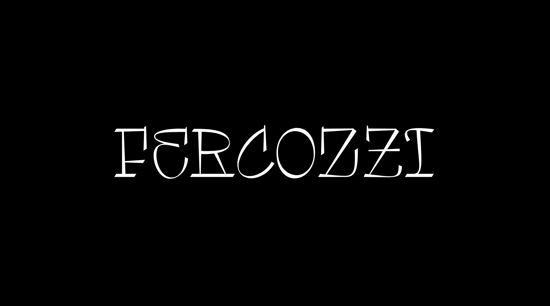
AN INTERVIEW WITH FER COZZI: "TYPOGRAPHY IS WHIMSY, CONVENTION AND ALSO POSSIBILITY"

IG: @fercozzi_letras

Argentinian type designer Fer Cozzi (Buenos Aires, 1986) began drawing in her early childhood, encouraged by her father. Contrary to the aspirations of many parents, he fantasized about the idea of his daughter studying Fine Arts. Thanks to a pair of books she borrowed from her secondary school teacher, Rubén Fontana's "Typographic Thought" and Jan Tschichold's "The New Typography", she became passionate about letters and went on to study Graphic Design, specializing in Typography Design. She became, in her own words, "a letter groupie"

Fer has a love affair with typography. When we ask her what drives that love, she answers, "I fell in love with everything about typography, from the arbitrariness of saying that a letter is a sound, to having to come up with a highly connective system of fully whimsical forms. Typography is whimsy, right from the jump it is all about conventions and possibilities. I don't know of another field that has both, ground to explore and fixed limits. That's a beautiful, fun challenge. I work in typography because it is fun for me, and having fun takes a lot of work."

I work in typography because it is fun for me, and having fun takes a lot of work

Fer participates regularly in the Tipos Latinos Biennial representing Argentina, everyone involved in the letters scene throughout the Latin American continent has noticed the region's constant improvement, and the designer agrees:

"I have been involved with Tipos Latinos for several years, and each time I’m surprised by something new. People are thinking and doing things with concerns and freedoms that push the boundaries of the collective imagination for Argentine or Latin American type design.

Yes, there is a more 'Latin' way of designing fonts: more irreverent, less formal, an 'I don't know what I'm doing but I'll do it anyway' attitude. But there is also an interest in being more "neutral", in disguising our provenance. In Argentina there is a lot of interest in every aspect of letters (calligraphy, lettering, typography...), but there is still no concept of a type industry when it comes to its design and legal use. We have to keep hustling, insisting, making things happen, talking... until it becomes understood and understandable as a profession, the way illustration or photography have. Although it frustrates me to think that production could be reduced to thinking about what sells, because we will miss out on trying things".

There is a more 'Latin' way of designing fonts: more irreverent, less formal.

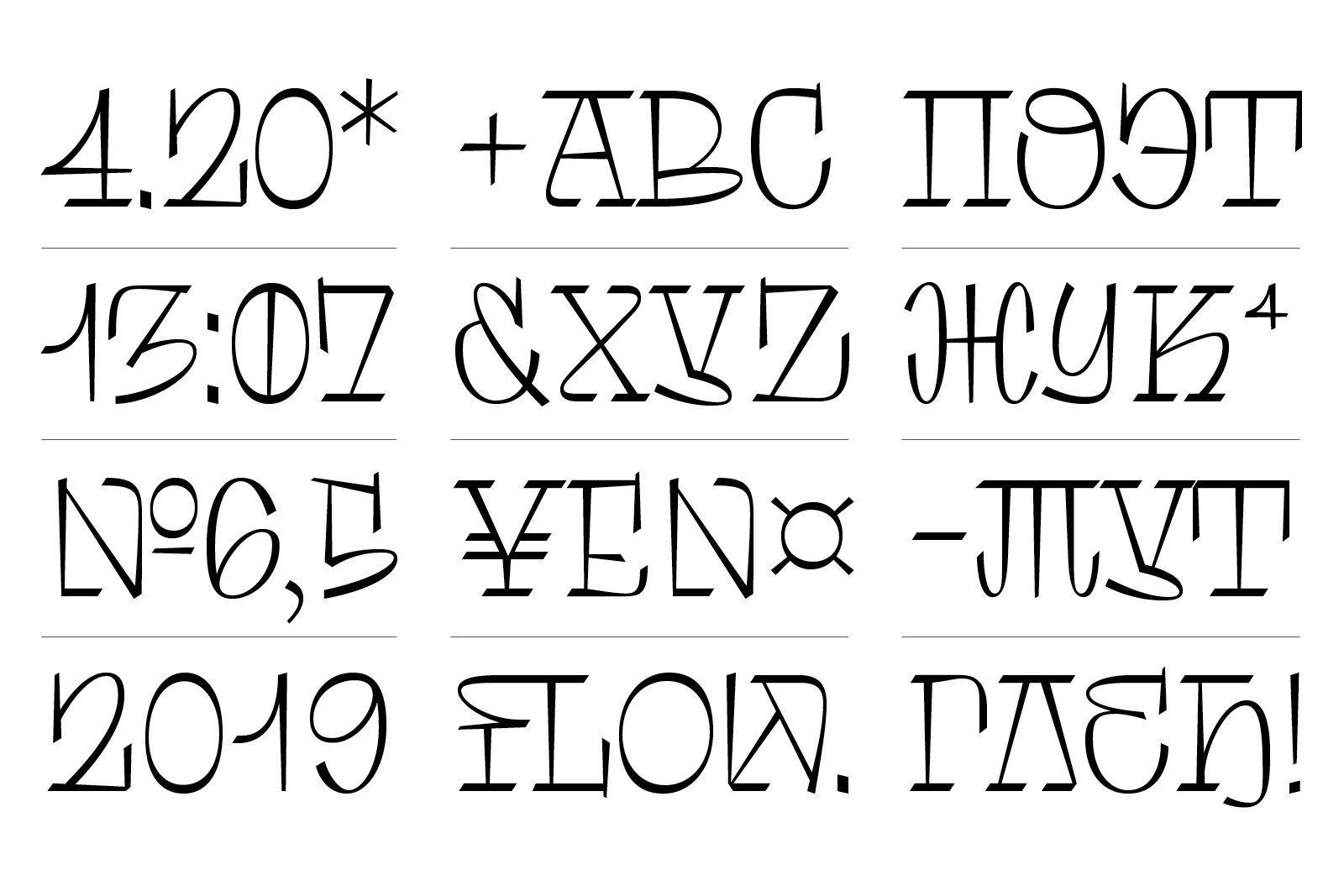
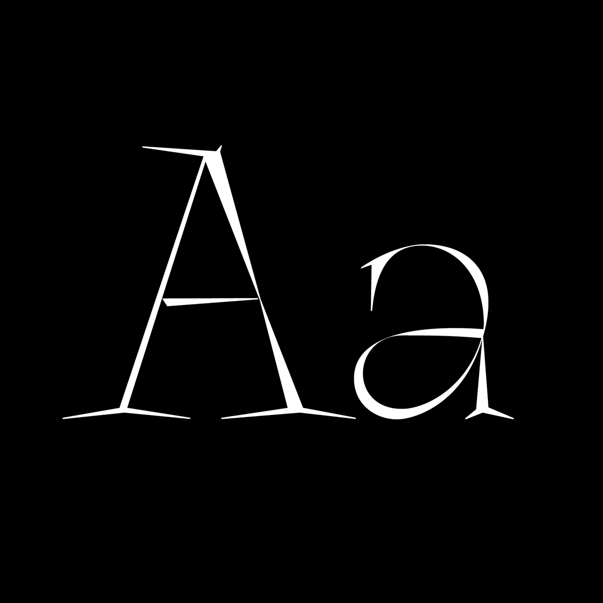
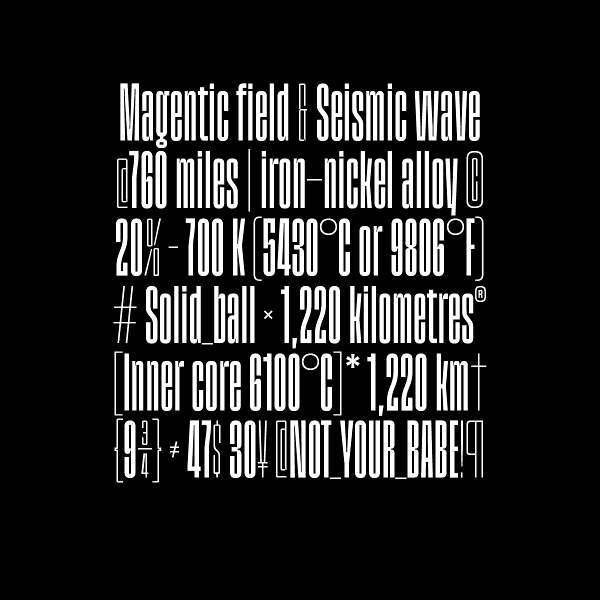
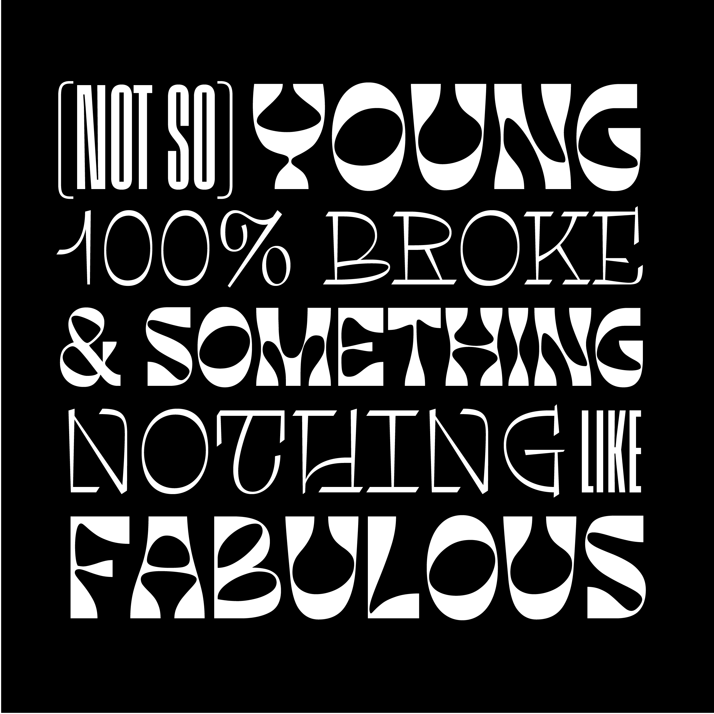
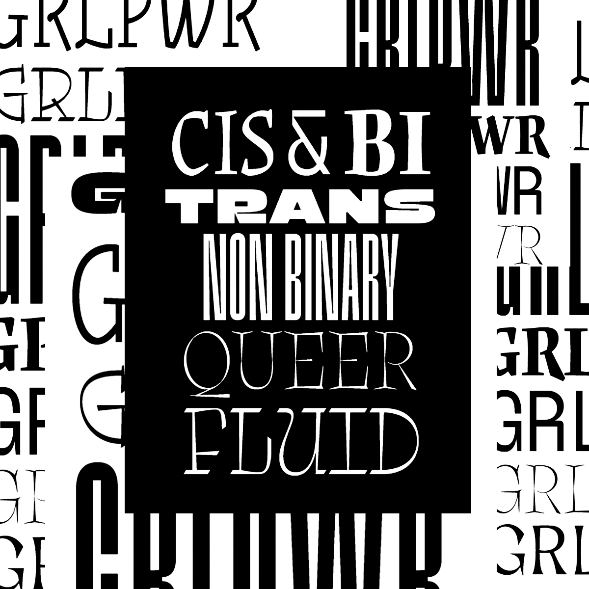
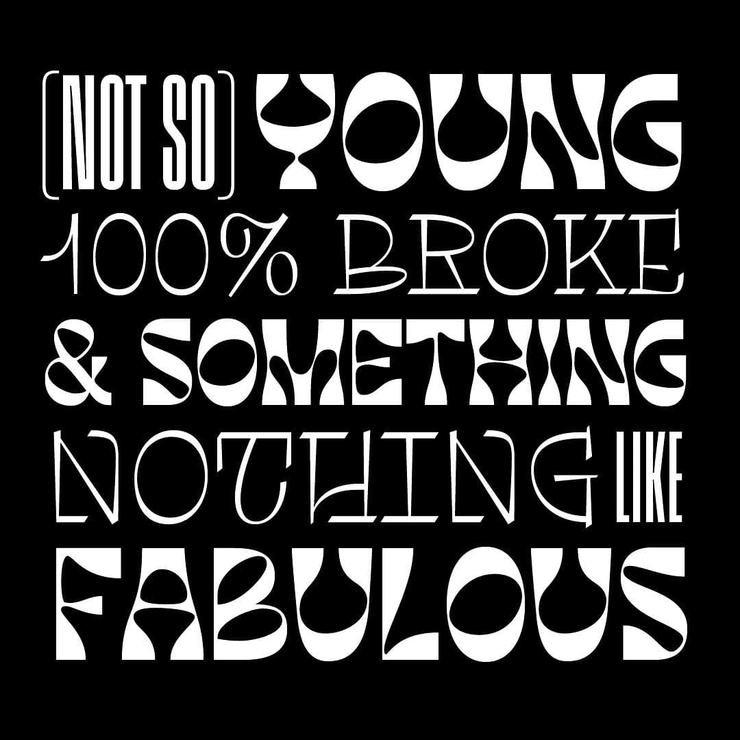
Fer Cozzi defines her fonts as hysterical but in the process of growing up, and her designs as eclectic and cheeky, a combination of various influences, as she says, "a summation of contingencies, a cocktail of personalities" that could not belong to anyone else and that inevitably blend together. She operates under two mottos: "fake it till you make it" and "when in doubt, scare them". However, her typefaces do share one common peculiarity: they all have women's names.

"I consider myself a feminist and I like to say it whenever I get the chance. All my fonts are named after women, not just on a whim, but also in reference to characters I admire or find interesting. It is an homage and an opportunity to highlight and value the role of women, not as muses but as 'makers'".

To elaborate, she explains the meaning of each name.

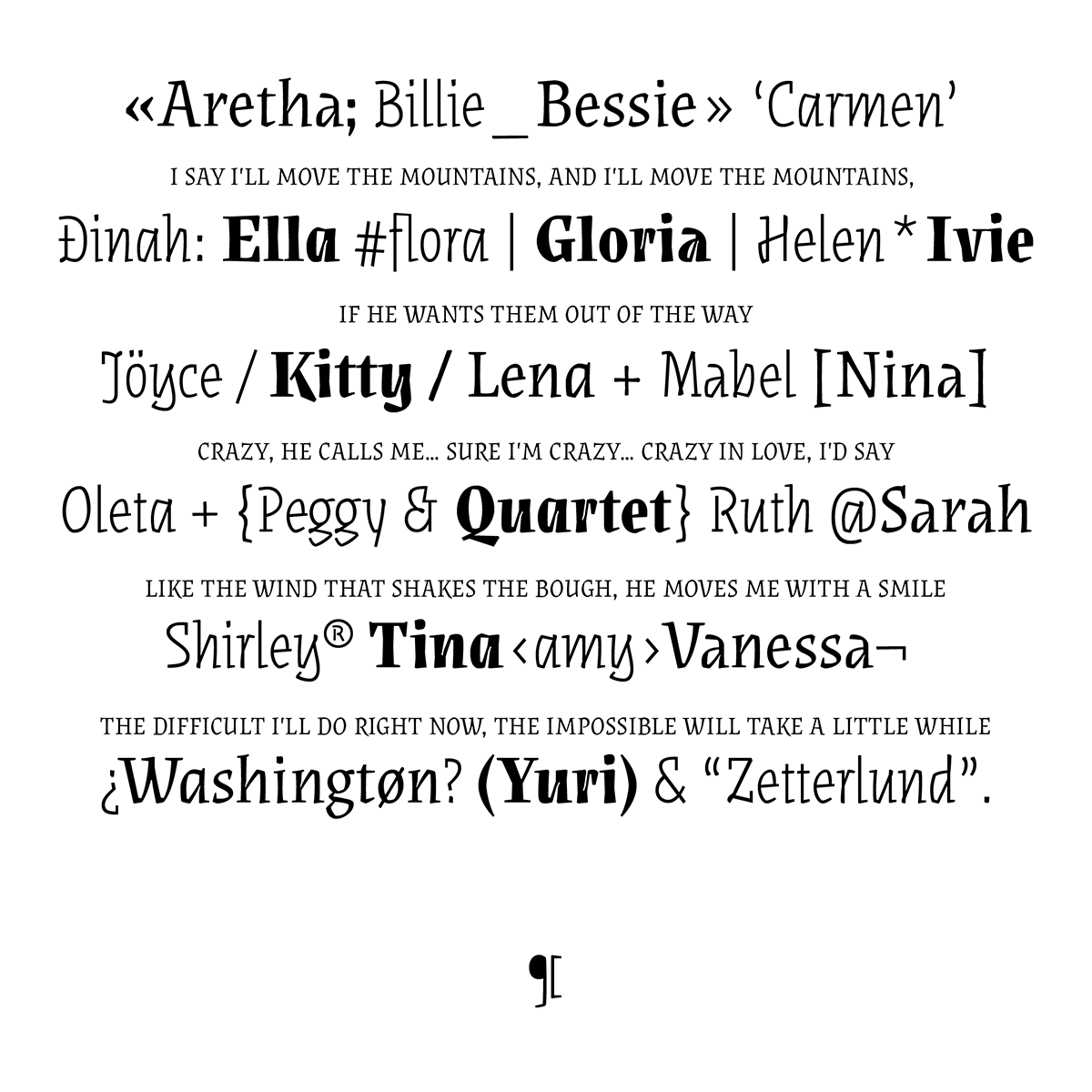
"The names emerge when the letters take on a stronger flavor and rhythm. They sing and dance and have voices of their own. Tomasa, for instance, embodies a way of appropriating urban and musical forms: it is named after a Chilean singer, Tomasa del Real. Augusta (still in development) is a monospace named after the first programmer in history, Ada Augusta Lovelace. Rosalind was born from a 'scientific' and modular concept of typographic forms, so I looked for a reference in science to baptize it: Rosalind Franklin. Likewise, Gabriella got a seemingly random name when I saw her character: she was sturdy, strong and loud... so I named her after the Little Mermaid's deaf friend from the animated series. Síncopa is named after the jazz singers I was listening to while working: Billie Holiday, Nina Simone and Ella Fitzgerald, and the unexpected, uneven rhythms of their musical style. As for Aidé, it was the name of my pet: an albino hedgehog from whom I derived the shapes, idea and overall tone of the font. It's not just about giving them women's names, it's about the stories they tell."

I consider myself a feminist and I like to say it whenever I get the chance

Fer's gesture is not a small one. In 2020 she was the only woman and the only Latina to be selected by the Type Directors Club as an "Ascender", a highly esteemed recognition in the world of letters.

"Type design is an industry and field dominated by white men from developed countries. I have been in situations where other designers assume that I'm a man... maybe because of my name, my work, who knows. I don't think they mean any harm, it's more of a predisposition to believe that typography is mostly men’s work. Taking part in events, contests, etc., has to highlight the diversity that exists in the whole field, not just in terms of genders but also in ways of thinking. We have to demystify the existing narrative about women in typography, more associated with calligraphy and lettering, or being someone's wife. The TDC’s recognition motivates me to keep doing, learning, improving".

Fer is also an assistant professor of the Master's degree in Typography at the University of Buenos Aires and teaches a typography course at UCES University. Designing typography when you are comfortable enough in your style and creative process to break the rules is different from teaching those rules.

To teach is to be willing to immerse yourself in someone else's will, with no control over it. Teaching is joining in the process and addressing questions with possibilities more than answers. Teaching a class makes me go through ideas and choices that are not the ones I would make if things were only up to me. However, it forces me to think more deeply, to stretch myself, to twist myself into a knot of arguments that may or may not have a logic that I understand. As a designer, I become the student and I seek to be questioned, to be made to doubt, to be forced to justify what I do... although I admit that I don't always apply the advice I get because that is the point of making decisions".

Fer Cozzi is currently developing the types Aimé, Aidé and June simultaneously, in collaboration with type designer Oscar Guerrero. "I'm pretty restless, anxious and intense, and I can't sit still and do nothing. It's also hard for me to focus on just one thing, so I work on several projects at the same time to manage my anxiety. Besides, having a lot of things in the works helps me with perspective, so I can think critically about what I'm doing".